Thursday, April 23, 2009

Form and Content 6


Katie Wrobel

Typography II

Section 001

Good:

1.   House of Blues:  This sign is not only successful in its use of type, but also in its use of graphics.  There is a good sense of balance with the placement of the heart in the center of the words.  There is repetition in the black shapes behind each letter.  I like the way the word “of” is placed vertically in the center as well.  The interesting design of the ragged black squares with white type on top stands out from other signs where type is simply spelled out and graphics aren’t used.  Another reason that this sign works is that the font works well with the style of the shapes around it.

2.  Urban Outfitters: The Urban Outfitters sign is probably one of my favorite uses of typography in signage.  The font is simple and in all caps, keeping the sign from becoming too complicated.  The counterforms of the letters are filled in and a bright green color is used for the entire sign.  Though simple, the style of this sign is somewhat trendy and the style along with the color attracts the age group that the store targets.  The design itself is well done, but the fact that it works with the store it is representing is what makes it even more successful.

3    Journeys: This sign is successful because of the attention it draws to itself and because of its use of movement.  As Journeys is store primarily for shoes, the sign is appropriate with its inclusion of arrows and dotted lines, indicated direction and movement that would be part of a journey taken on foot.  Various parts of the letters in the sign are extended as well, adding more movement to the piece.  The somewhat transparent dotted lines work as a continuation of the strokes of the letters.  The compass graphic coming out from the “o” leads the eye across the word and brings much visual interest.  The exaggeration of some lines is equally balanced in the word.  The colors and the expressive lines of the type make the sign feel younger to target the age group of the store.

Bad:

1.   Gelato CafĂ©:  Though this isn’t an awful example of typography, I don’t find it to be very successful either.  The color of the script type is fairly dull and doesn’t attract the viewer’s eye very well.  The red circle behind the type draws more attention than the main words.  The sign for a business should get the potential customer to see the name of the business and attract them; a red circle being the first thing the viewer notices won’t grab someone’s attention to go there.  Another small issue with this sign is that the type inside of the red circle is slightly cut off; the first and last letters of the word in the top half of the circle are covered by the larger type.  There’s really no reason for that and makes the word look like it doesn’t fit.

2.   Super Tan:  I found both the sign and the logo for this tanning salon very unsuccessful.   The font isn’t interesting; there is no reason for it to be italic and it doesn’t have any relationship to the type of business it is.  It is not aesthetically pleasing; it looks more like it was put together quickly than designed.

3.   P. Graham Dunn:  This sign isn’t horrible but I’m not particularly fond of it.  The combination of handwritten style type with a serif type doesn’t work well, at least in this case, nor does it make sense for this store.  In my opinion, this sign lacks interest and would not succeed in pulling me into the store; I would most likely overlook it.  I also do not understand why the first half of the sign uses both upper and lowercase letters while the last part is in all caps.

Friday, April 3, 2009

Form and Content 5

Katie Wrobel

Typography II

Section 001

The piece I chose is from How Magazine’s 2009 International Design Annual. It received an “Outstanding” rating in the poster section of the magazine.  This poster, done by Somewhat Awesome Design artists Ronald J. Cala II and Katie Hatz, was designed as a self-promotion poster for their Somewhat Awesome Design firm. The content of this piece includes a written introduction to this design firm and definitions of the words “somewhat,” “awesome,” and “design.”  This content relates to the form as the form consists of silhouetted portraits of the two designers of the firm. The forms represent the people that the content talks about. A specific example of form relating to content is that Katie Hatz was the one to write the typographic content of the piece and there are pens incorporated into the form of her portrait to show that she was the writer.  The piece is visually interesting because of the way the portraits are formed. The top halves of the bodies are in red and filled in with the text.  As the viewer’s eye follows the form toward the bottom, there is no continuation past the mid-section of the person.  Instead, all four figures blend into the bottom of the piece and continue to be filled in with text. In the negative space of those figures, however, are the remainders of the figures from the mid-section and below.  These figures are filled in with solid black with no text inside, and continue to the top of the page to form the negative space around the red figures. This effect also represents the collaboration between two artists with very different styles; they each work differently but their works morph together to create great designs, just as the red and black figures morph together to create the full image. The contrast between the red and black with the continuation of the black in the text over the red space is another part that makes this piece visually interesting. An element of design that is prominent in this piece is that of repetition; the shape of the human figure is repeated several times and there is also a feeling of repetition within the body of text. Unity is observed in the text throughout the piece; it brings all of the red space together and brings a relationship between the figures. The alternating of the black and red and the way it is equally distributed gives balance to the piece as well. The amount of contrast between the two colors almost makes the forms look like they’re coming off of the page. The type relates to the image because the image is all about different ideas working together to make one good idea and the type explains that idea through words rather than through visual elements. The type is also handwritten, making it a more personal message from the artists themselves to the viewer as the artists are talking about the design firm. Overall the piece is successful and visually interesting and does a good job in making me interested in finding out more about this design firm.

Thursday, March 5, 2009

Form and Content 4

Katie Wrobel
Typography II
Section 001
The work I chose is from the Typographic Design section of the AIGA website design archives. The piece, titled Taking Things Apart… by art director/designer Steff Geissbuhler, is a poster for an event called “Taking Things Apart and Putting Things Together” sponsored by the American Chemical Society. The content of this piece concerns an event about chemistry and is informing people about it so that they will attend. The form of this piece relates to the content in the way that it incorporates the idea of chemistry; the display type used for the event title is broken into pieces, literally showing the idea and title of the event: taking things apart. The piece is visually interesting mainly because of the design of the display type. There are a variety of type styles used to emphasize its broken up scheme and two colors are used to further distinguish some letters. Each word has exaggerated kerning on both ends of the scale to add more to the idea of taking things apart and putting things together. Another interesting visual element is the directional line. The display words are not placed directly under each other, yet are far to the right or left of the word above them. There is a small area of space near the center of the group of display type where each line overlaps; this overlapping of the words creates an imaginary diagonal line from the top left to the bottom right of the page. In addition, the separated placement of each display word adds emphasis to the direction of the text, which creates another directional element perpendicular to the aforementioned imaginary line. The fact that the display type is spread out in this fashion rather than being fit into a text box adds visual interest as well. The directional lines that are created with the type placement add a great sense of movement to the piece. Unity and variety are both evident in this piece: unity in the same font being used throughout and variety in the difference in type styles and colors. There is also repetition in some of the combinations of letters. Emphasis is placed on the display type especially due to the bold white letters that draw the viewer’s eye to that area. The type relates to the image because the majority of the letters of the display type are found on the periodic table of elements. The letters are broken up and spaced apart from each other based on what letters make up an element from the periodic table. Each letter or letter pair from the table have the element that they represent typed underneath them. This allows the type to directly relate to the image as it is a direct tie-in to chemistry, which is what this poster is telling us about.

Thursday, February 19, 2009

Form and Content 3

Katie Wrobel

Typography II

Section 001

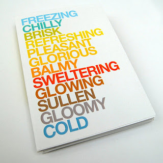
The work I chose is the cover of a calendar designed by Jonathan Davies and was found on www.behance.net.  Behance.net is a network for creative professionals to showcase their work, get others to know them and their work, and network with others in the industry.  The content of a calendar is obviously the months of the year.  The form of this cover includes words whose meanings and colors represent each month.  The form of these words relates to the content because the words accurately represent the twelve months without directly listing them.  The piece is visually interesting because the words stand out on the white background and the concept of the calendar is successfully shown without over-designing the page.  It is a very simple design but works well that way.  Each word relates to the season it is representing, as does the color chosen for each word.  A number of principles of design are found in this piece.  The artist achieved a sense of balance between the words with the top and bottom words starting as cooler colors and working their way toward the center by getting warmer.  The contrast of the bold, capitalized, colorful letters against the white background makes the words pop out at the viewer, drawing them in.  There is unity in the use of one font and size for all of the words as well as variety in the change of color and word length.  The type relates to the image because this is a calendar cover and the words on it convey the separation of time through the year.  It is separated into twelve segments like any calendar, but the idea of choosing adjectives and colors in place of the names of each month is innovative.

Thursday, February 5, 2009

Form and Content 2


Katie Wrobel
Typography II
Section 001
The work I chose is from Communication Arts Interactive Annual 14, September/October 2008, pages 152-153. The context in which this work is presented is in the self-promotion section of the magazine. This piece is a webpage design for Jam3media. Jam3media is an interactive studio specializing in Flash and database-driven websites. The content of this webpage consists of images from various portfolios; the connection this content has to the form is that the size of the images is reduced and they are placed together in a Tetris-like pattern to form words of either the webpage name or of the artist. On each artist’s page, their work is what forms the squares that spell out their name. The piece is visually interesting primarily because of how efficiently the work is compiled. Viewers can browse the site and see each artist’s work in the tiles of their name. The mosaic design is aesthetically pleasing in how it contrasts the background. The slight mirrored effect under the mosaic design of each page is another interesting element. The primary principles of design used here are unity and variety. There is variety in how each image is separate and even unrelated, yet there is unity in how they are all used together to form a design. This image is a great example of the gestalt principle as well. Emphasis is also evident because the mosaic word on each page is set off from the black background, drawing the eye straight towards it to examine the portfolio pieces that the word is comprised of. Balance is also achieved in placing the mosaic words in the center of the page and anchoring them with the slight mirrored effect. The type relates to the image because the sum of the images is what makes the type exist.

Thursday, January 22, 2009

Form and Content 1


Katie Wrobel
Typography II
Section 001
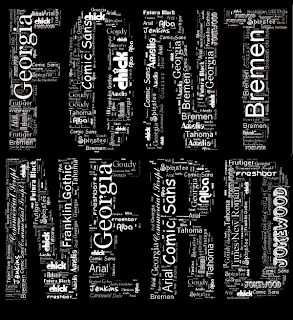
The work I chose is from the website www.neoformix.com/Projects/portfolio/index.html.  The context it is presented in is a portfolio website with work from an artist named Jeff Clark.  Many of his portfolio pieces are interactive applications including data analysis and visualization.  The piece I chose was done as a T-shirt design for fans of typography and was created with one of his applications; it consists of the words "font nerd" filled with a variety of fonts each spelling out their font name.  The form is two words relating to typography, and the content is a wide variety of fonts.  The content relates to the form in the way that the words "font nerd" are typography in themselves, and they are filled with all types of fonts and letters, which is what typography is made up of.  What makes the piece visually interesting is that it is purely typographical.  I also like the way the artist chose to use white font on a black background.  The choice to keep the flow of the negative space between the smaller words and the overall background as opposed to outlining "font nerd" was a good one.  A prominent principle of design seen here is repetition with the words in various fonts being repeated over and layered to create other words.  There is unity in the way font names are spelled out repeatedly, and there is also variety from the use of different font styles.  Balance is achieved in the way the weight and size of the words are evenly distributed throughout the letters they are forming as a whole.  Type not only relates to this image, but it is what makes up the image entirely.  The type is used repeatedly together to make up more words, making it an obviously type dominant image.