Katie Wrobel
Typography II
Section 001
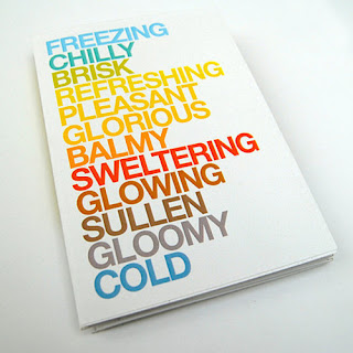
The work I chose is the cover of a calendar designed by Jonathan Davies and was found on www.behance.net. Behance.net is a network for creative professionals to showcase their work, get others to know them and their work, and network with others in the industry. The content of a calendar is obviously the months of the year. The form of this cover includes words whose meanings and colors represent each month. The form of these words relates to the content because the words accurately represent the twelve months without directly listing them. The piece is visually interesting because the words stand out on the white background and the concept of the calendar is successfully shown without over-designing the page. It is a very simple design but works well that way. Each word relates to the season it is representing, as does the color chosen for each word. A number of principles of design are found in this piece. The artist achieved a sense of balance between the words with the top and bottom words starting as cooler colors and working their way toward the center by getting warmer. The contrast of the bold, capitalized, colorful letters against the white background makes the words pop out at the viewer, drawing them in. There is unity in the use of one font and size for all of the words as well as variety in the change of color and word length. The type relates to the image because this is a calendar cover and the words on it convey the separation of time through the year. It is separated into twelve segments like any calendar, but the idea of choosing adjectives and colors in place of the names of each month is innovative.
great review. I agree on all your points. I would like to get this calendar! It's very well done. Simple, clean, but appropriate.
ReplyDelete