Katie Wrobel
Typography II
Section 001
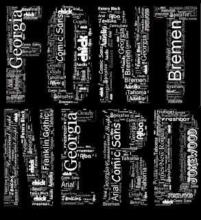
The work I chose is from the website www.neoformix.com/Projects/portfolio/index.html. The context it is presented in is a portfolio website with work from an artist named Jeff Clark. Many of his portfolio pieces are interactive applications including data analysis and visualization. The piece I chose was done as a T-shirt design for fans of typography and was created with one of his applications; it consists of the words "font nerd" filled with a variety of fonts each spelling out their font name. The form is two words relating to typography, and the content is a wide variety of fonts. The content relates to the form in the way that the words "font nerd" are typography in themselves, and they are filled with all types of fonts and letters, which is what typography is made up of. What makes the piece visually interesting is that it is purely typographical. I also like the way the artist chose to use white font on a black background. The choice to keep the flow of the negative space between the smaller words and the overall background as opposed to outlining "font nerd" was a good one. A prominent principle of design seen here is repetition with the words in various fonts being repeated over and layered to create other words. There is unity in the way font names are spelled out repeatedly, and there is also variety from the use of different font styles. Balance is achieved in the way the weight and size of the words are evenly distributed throughout the letters they are forming as a whole. Type not only relates to this image, but it is what makes up the image entirely. The type is used repeatedly together to make up more words, making it an obviously type dominant image.
Excellent choice, excellent review! Nicely written. Perfect example of what I'm looking for.
ReplyDelete